Next week, when Federal Reserve officials meet to decide whether to raise interest rates for the first time in nine years, one question will be front and center: How much faith should be placed in a line on a graph first drawn by a New Zealand economist nearly six decades ago, based on data on wages and employment in Britain dating to the 1860s?
That would be the Phillips curve, one of the most important concepts in macroeconomics. It shows how inflation changes when unemployment changes and vice versa. The intuition is simple: When joblessness is low, employers have to pay ever higher wages to attract workers, which feeds through into higher prices more broadly. And inflation is particularly prone to rise when the unemployment rate falls below the “natural rate” at which pretty much everybody who wants a job either has one or can find one quickly.
As the Fed’s chairwoman, Janet L. Yellen, put it in a 2007 speech, the Phillips curve “is a core component of every realistic macroeconomic model.”
Except it doesn’t work. Or at least, it hasn’t worked very well in the last few decades in the United States. And it has proved particularly problematic to try to use that historical relationship to predict where inflation is going.
That is why a longstanding academic debate is now at the core of the Fed’s policy debate. Ms. Yellen and many of her Fed colleagues have indicated that they think they should raise interest rates this year, in part because the Phillips curve suggests there will be excessive inflation if they don’t. The unemployment rate was 5.1 percent in September, just a smidgen above the 4.9 percent that Fed leaders believe is the appropriate jobless rate in the longer run.
In other words, if you believe in the traditional Phillips curve, inflation should be taking off any day now.
But this month, two Fed governors, Lael Brainard and Daniel K. Tarullo, argued against a rate move. Ms. Brainard said that the Phillips curve relationship was “at best, very weak at the moment.” Mr. Tarullo said that it was “probably wise not to be counting so much on past correlations, things like the Phillips curve, which haven’t been working effectively for 10 years now.”
It’s only a slight exaggeration to say that the Fed’s rate decision this year will be based on whether its leaders really believe that the Phillips curve is useful in describing how the economy works in 2015.
Wage inflation is on the rise view:
From Brad DeLong
Must-Watch: Really, really bad news for the American economy. Alan Krueger concludes that we are now near "full employment" in a monetary policy-Federal Reserve-inflation sense. The implications? The implications are:
- that the failure of the government and the Federal Reserve to more aggressively boost recovery has turned what was excess cyclical non-employment into structural non-employment,
- that essentially none of the drop in production relative to the pre-2008 trend can or will be recouped without noticeably higher inflation.
Alternative view (Ironically from WCSG and Matt Phillips)
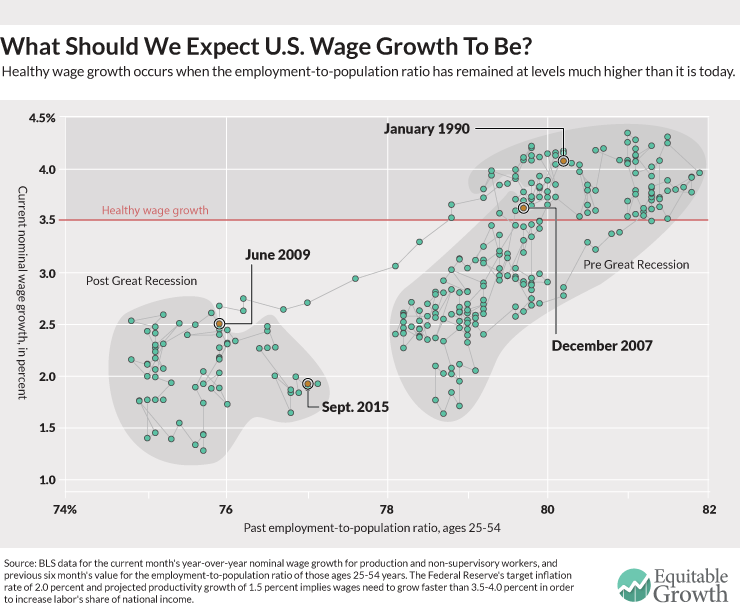
To understand the changes in the overall inflation Phillips curve, it might be useful to look at another version of the curve: the relationship between unemployment and “wage inflation,” better known as wage growth. Now, that curve doesn’t look that great either, but that might be because the unemployment rate is currently overstating the health of the labor market. If we take a look at the relationship between wage growth and another measure of labor market slack, however, the relationship might hold up.
The graph shows the relationship between wage growth for production and non-supervisory workers, and the employment rate for prime-age workers six months prior. It clearly shows that when the labor market is tighter (when the employment rate is higher), wage growth is stronger.

 RSS Feed
